Proportional flow maps
On proportional flow maps3, the width of lines is proportional to the volume or size of movement between places (see Figure 4). They are particularly useful for displaying the results of traffic flows, but can be used to indicate any movement across a space.
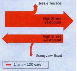
Fig. 4. Proportional flow map for traffic volumes in a town center
Dot maps
Dot maps4 show the distribution of items such as people, houses or plants (see Figure 5). The pattern of dots may also be analysed statistically, e.g. by nearest neighbour analysis. When constructing dot maps consider the dot size – this can be used to generate a hierarchy based on the relative sizes of populations.
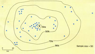
Fig. 5. Dot distribution map (including isolines). This example shows the sphere of influence of visitors to a honeypot site, based on questionnaire data.
Graphs
Unlike most maps, graphs can be produced using computer software such as Excel or Lotus. Using graphs can also demonstrate your skills. You need to be very careful in selecting the most appropriate type of graph from the computer menu, not always the first one that appears on the drop-down list. Avoid some of the more showy three-dimensional graph types which can be complex for the reader to interpret.
Line graphs
Line graphs5 are used when measurements are continuous, e.g. traffic, employment or river discharge (see Figure 6). They show the relationship between two variables, one of which causes the other to change, e.g. temperature and altitude. Altitude causes the temperature to change so it is the independent variable (x-axis), with temperature on the y-axis (dependent variable). If you have very large ranges on one single graph, e.g. 2-10,000 then consider using log or semi-log paper.
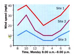
Fig. 6. Line graph showing changes in wind speed over 12 hours in three locations. Multiple data sets are displayed on the same axis which has been reseated to accommodate all data.
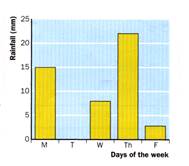
Bar graphs
In this type of bar graphs6 the horizontal x-axis represents a number of separate categories and the vertical axis shows the values or frequency (see Figure 7). Often a gap is left between bars (note that the computer won't do this automatically).
Дата добавления: 2021-10-28; просмотров: 604;
Поиск по сайту
Публикации по технике и механике
Публикации по биологии
Публикации по информатике
Публикации по строительству
Публикации по физике
Публикации по химии
Публикации по электронике

Публикации по искусству
Публикации по географии
Публикации по медицине